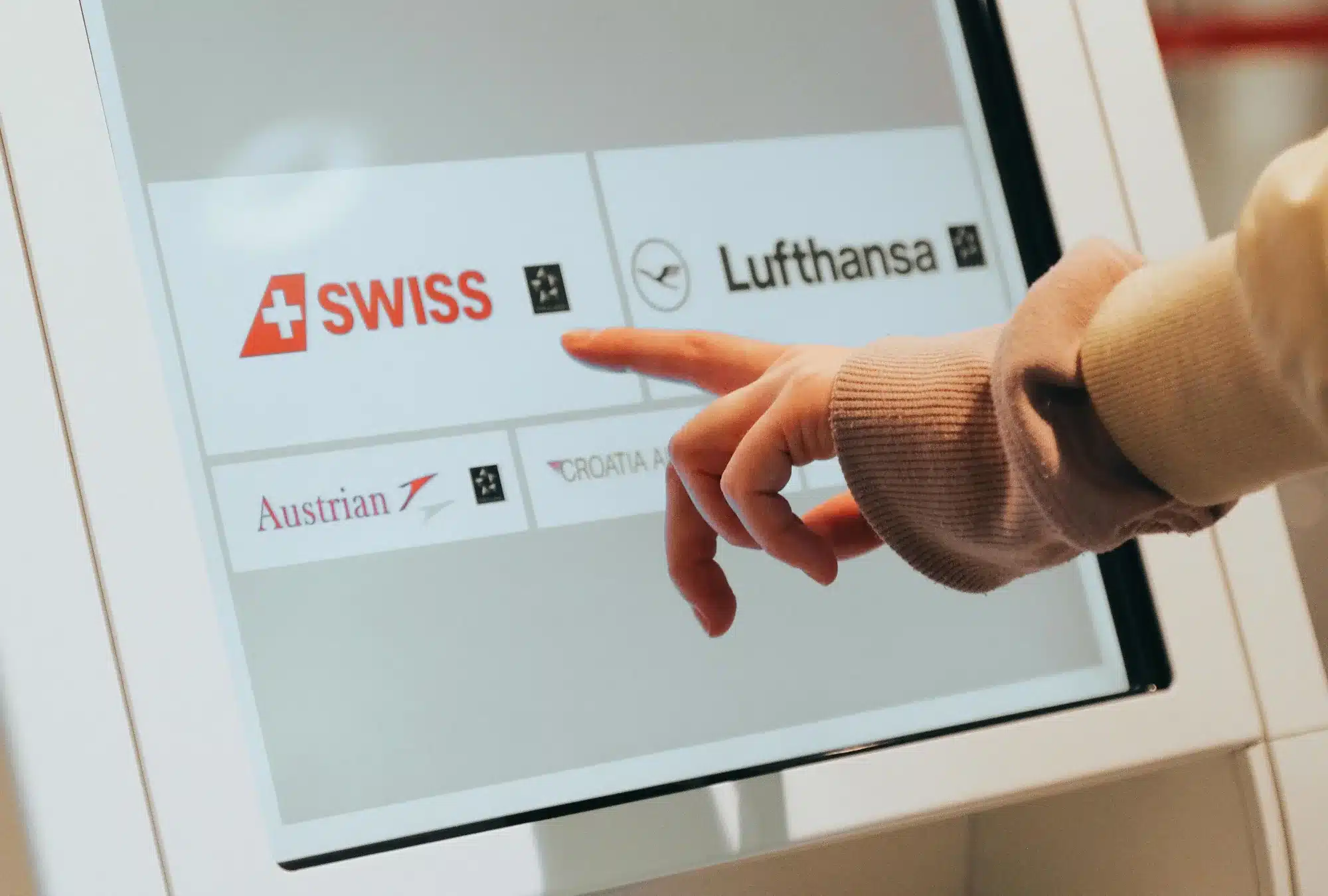
Digital touchscreen kiosks are often seen in the public realm, mainly in the transport and tourism sectors. How can you effectively harness the visibility and interactivity that you get with these kiosks?
They’re normally powered by a website, but if you put a normal website on there, it will be a clunky and frustrating experience for the user. So we need to start with examining the different considerations that need to be taken into account in web design for a touchscreen kiosk to make the interaction smooth and rewarding.
Responsive web design vs touchscreen kiosk web design
To examine best practices for web design for a touchscreen kiosk and how it differs, we need to talk about the usual requirements for web design first. Web designers focus on responsive web design, which means that the same website is responsive to the device that it’s viewed on, whether it be a mobile or a 40-inch screen.
The website is designed in a column layout, and on a mobile screen the columns will be shown one by one, one after the other. But we’re not finished yet: to make the site fully mobile-friendly, we would need to change the order of some elements; for example, the search function might need to be moved to the top of the mobile screen rather than being buried in the sidebar, which would usually be displayed last after the main page content.

It’s not like designing a poster, where you know what size the paper will be, so you can be sure that a heading will always have a line break in the same place. The website will adapt to the screen size and orientation and will always be a compromise to some extent.
When it comes to designing for touchscreen kiosks, in some ways it is like designing a poster. Suddenly we have the luxury of knowing what the screen resolution and size are, knowing what the screen orientation is, and knowing which browser is being used. Firefox and Edge have special versions designed for touchscreen kiosks so we can specify which browser people are using without giving people a choice, and lock it down so that people can’t open a new tab or access the menu – they’re just able to navigate around our application.

Mobile web design vs touchscreen kiosk web design
There are similarities to designing for Mobile devices because they are, after all, both touchscreens. One similarity is that the buttons need to be big. We talk about designing for ‘fat fingers’, because we’ve all seen websites where the buttons or links are too small or too near to other elements to be able to easily click it with your finger.
Also, as with a mobile device, we don’t have a hover state. If you’re using a mouse on a desktop, you can put your mouse pointer over something and it might change colour to indicate, for example, that it’s something you can click on. We don’t have that on a mobile or a kiosk, because if you put your finger on the screen, then that represents a click straight away. So, if an element is clickable, then it needs to look like it’s clickable – buttons need to scream ‘I am a button’.
We talk about website accessibility for people with visual and other impairments in web design, but a touchscreen kiosk brings its own considerations
There are also some differences. We actually need to increase the clickable areas around buttons to give a bit more tolerance because when you’re looking at your mobile, you’re able to line yourself up with the screen. But on a kiosk, people are different heights, coming at it from different angles, so they might not actually realise that they’re not looking at the screen straight on, and therefore they’re not clicking on the right area. So you need to give a bit of extra room around the buttons to make them easily clickable.
Also, we want to minimise hand movements on a kiosk, because you can’t reach the corner of the screen with your thumb like you can with a mobile. So this informs how we design the user interface, as we don’t want to require people to keep having to press a button in the corner of the screen. The navigation system needs to be consistent on every page, without having to rely on pressing a menu button to be able to see the navigation options, which would quickly get tedious on a kiosk.
Web design considerations specific to web design for touchscreen kiosks
One day, you’ll be able to go to the train station and collect your pre-bought ticket from the machine by just scanning a QR code. But at the moment, you have to type in your reference number on the kiosk, and using the onscreen keyboard can be a frustrating process. Therefore, we want to try and avoid search boxes to do away with the onscreen keyboard, and give people another way to find the content they’re looking for. Categorising the content logically is therefore important.
Scrolling on a touchscreen can also be fiddly, so getting all the relevant content onto the same screen without making it cluttered is the balance we’re trying to strike. If scrolling is necessary, we can provide multiple easy ways of doing so – big arrow buttons as well as the ability to swipe left and right, which many users will already be familiar with.
Accessibility considerations
We talk about website accessibility for people with visual and other impairments in web design, but a touchscreen kiosk brings its own considerations, which should inform the initial purchase and specification of the kiosks themselves.
Here is a brief list of some of the important factors:
- Height and reach – so that people using wheelchairs are able to use them
- Space around the kiosk – so that wheelchair users can easily access them
- Alternative navigation methods – for example, a trackball to control a pointer instead of having to touch the screen, or the navigation being at the bottom of the screen rather than the top
- Text-to-speech – integrated headphone jacks can provide audio instructions and read the text onscreen out loud
- Web design accessibility standards – as with all websites, we need high-contrast colours, large enough fonts, alternative text for images and subtitles for videos
Making using the kiosk an enjoyable experience
Here we’ve mainly talked about the technical considerations, but that’s not all you need to think about. Your content needs to be kiosk-friendly too!
We’re not only experts in making a website for kiosks, we can also help you make your content as engaging as possible for the audience gathered around your touchscreen. Get in touch to find out more or ask us to do a presentation.